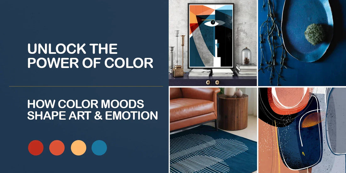
Unlock the Power of Color: How Color Moods Shape Art & Emotion
Color as the Language of Emotion in Art
Color isn't just a visual element—it's a powerful tool that artists use to communicate emotions, set moods, and evoke psychological responses. Each color carries its own unique emotional weight, and understanding these associations can enhance the way we experience art. From the fiery intensity of red to the tranquil calm of blue, colors are more than just pigments on a canvas; they are the mood-setting agents in an artist's narrative.
In this post we’ll explore the fascinating world of color psychology, examining the emotional connections we have with colors and how artists use these hues to express complex emotions. Whether you're an artist or an art enthusiast, this deep dive will help you understand how color can transform the mood of a piece, and maybe even inspire your next creative project.
Red: Passion, Energy, and Power
Mood Associations: Red is often seen as the color of passion, energy, love, and power. It is intense, dramatic, and sometimes even aggressive. Red is a color that commands attention, and it can evoke strong feelings of excitement, urgency, or anger. Artists frequently use red to ignite the viewer’s emotions, drawing them into the scene.
-
Examples in Art:“The Red Studio” by Henri Matisse – This vibrant work uses red to evoke a sense of vitality and warmth. The bold use of the color helps to create an intimate, immersive atmosphere, emphasizing the artist's personal space.

-
“The Scream” by Edvard Munch – The fiery orange-red sky in Munch’s iconic painting creates an unsettling atmosphere, mirroring the intense emotion of the figure in the foreground.

Artist's Intent: Red often reflects themes of love, danger, or intensity. In “The Red Studio,” Matisse uses red as a unifying color to evoke both the warmth of his creative space and the vibrant energy of the artistic process.
Blue: Calm, Serenity, and Trust
Mood Associations: Blue is often associated with calm, serenity, and trust. It’s a color that invokes feelings of peace and tranquility, much like the open sky or the deep ocean. However, blue can also be linked to sadness or melancholy, depending on its shade. Light blues are airy and peaceful, while darker blues can convey depth and introspection.
- Examples in Art:“Starry Night” by Vincent van Gogh – The swirling blue night sky in this masterpiece exudes a calm yet powerful emotion, evoking a sense of wonder and tranquility.
-
“Blue Nude” by Henri Matisse – This piece uses blue to convey simplicity and calm, with the color evoking both a sense of stillness and sensuality

Artist's Intent: In “Starry Night,” van Gogh uses blue not just to paint the night sky, but to create a sense of depth and complexity in the natural world. The use of blue reflects both the vastness of the universe and the isolation the artist felt.
Green: Balance, Growth, and Harmony
Mood Associations: Green is the color of nature, life, and growth. It symbolizes balance, renewal, and tranquility. Green is often used to express harmony and rejuvenation. It is the perfect color to invoke a sense of calm, as it is directly connected to the natural world.
Examples in Art:
-
“The Hay Wain” by John Constable – The lush greenery in this painting of the English countryside exudes peace and a sense of pastoral calm, drawing the viewer into a serene, natural world.

-
"Woman with a Parasol” by Claude Monet – Monet’s use of greens in the landscape surrounding the figure in this piece emphasizes the harmony between human life and nature.

Artist's Intent: Constable’s landscapes are rich with greens, symbolizing both the beauty and simplicity of nature. In “The Hay Wain,” the greenery creates a peaceful, idyllic atmosphere, offering a visual retreat from the hustle and bustle of modern life.
Yellow: Happiness, Optimism, and Caution
Mood Associations: Yellow is the color of sunshine, joy, and optimism. It’s often seen as a cheerful and uplifting color that brings warmth and happiness. However, yellow can also symbolize caution or even anxiety when used in excessive amounts, as it can overwhelm the senses.
Examples in Art:
- “Sunflowers” by Vincent van Gogh – This iconic series of paintings uses yellow to evoke feelings of warmth, happiness, and vitality. The vibrant yellow of the sunflowers brings energy and life to the composition.
-
“The Yellow Christ” by Paul Gauguin – Gauguin’s use of yellow in this piece evokes a sense of spiritual intensity and reverence. It’s a departure from the joyful use of yellow, instead creating a sacred, almost otherworldly atmosphere.

Artist's Intent: In “Sunflowers,” van Gogh uses yellow to express life’s vibrancy and energy. The color brings the flowers to life, creating a sense of positivity and exuberance, while in “The Yellow Christ,” the artist’s choice of yellow is symbolic of the divine, creating a sense of reverence and contemplation.
Conclusion: Color’s Emotional Impact in Your Art
As artists, we have the power to use color not only to beautify but to communicate. Colors speak to us on a deep, emotional level, often without the need for words. Whether you’re exploring the fiery depths of red or the tranquil shades of blue, understanding the psychological associations of color can transform the way you create and experience art.
Next time you’re in the studio or admiring a piece, take a moment to notice the colors and reflect on how they make you feel. Are they invoking excitement? Calmness? Introspection? Consider how you might incorporate these emotional cues into your own work, whether you're using color to reflect a personal experience or to engage your audience.